Brand development for a talented cartographer.
Client Need
Julie Witmer has been creating custom maps for about a decade. When we first met at a NACIS conference, her visual identity consisted of her name, her title, and a cartoonish clip art graphic. As a professional cartographer, her business, Julie Witmer Custom Maps, needed a style that demonstrated her commitment to high-quality map products.
Design Solution
After initial conversations, Strong Heart designed a new brandmark that reflects professionalism with both traditional and modern sensibilities.
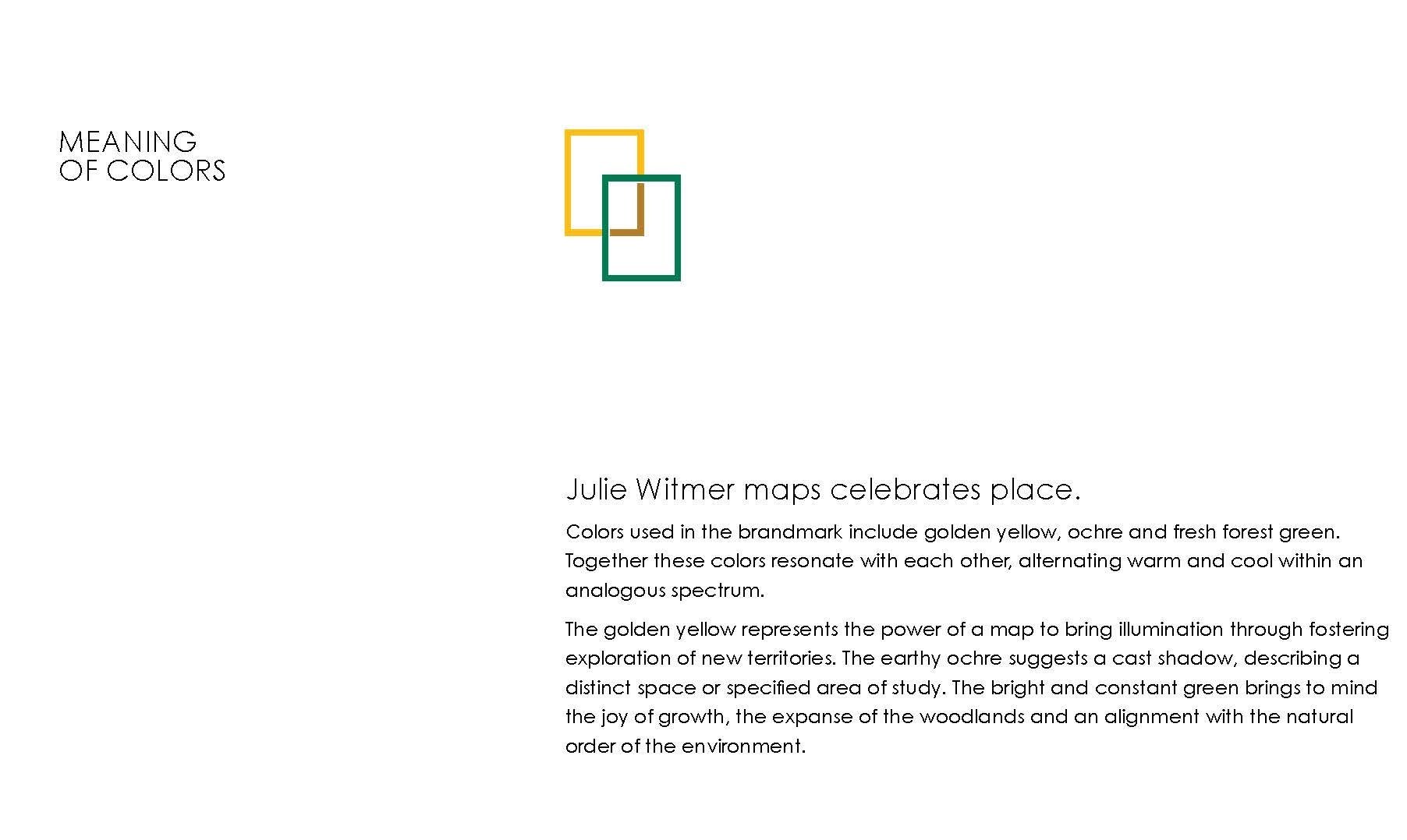
Julie Witmer is all about clarity. The graphic mark developed for her business uses superimposed rectangles to delineate a specific area of focus. Variations of value on the rectangles create a sense of the dimension of a particular place.
Brand colors deep green, gold, and ochre were chosen to relate directly to the earth, physical areas that are mapped. The gold and the rectangular form are a nod to NatGeo.
The typographic wordmark is set in Palatino which was designed by Hermann Zapf. It is a pleasing Old-style serif face that acknowledges its lineage to older typeface designs and communicates openness and lucidity through its elevated x-height. Her descriptive tagline is set in all lower case Museo Sans 300 lending simplicity and friendly touch. This typeface agreeably balances the elegant humanism in Palatino and the mechanically precise graphic mark.


