

BRANDING / Happy Wellness logo full color version.

Website design for Happy Wellness.

Simplified Happy logo in black only

Happy Yoga Mat. design for three distinct audiences.
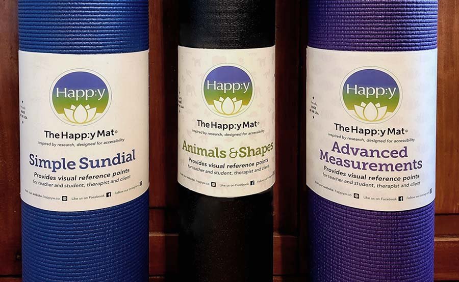
Labels designed for retail sale of the Happy Yoga mats.
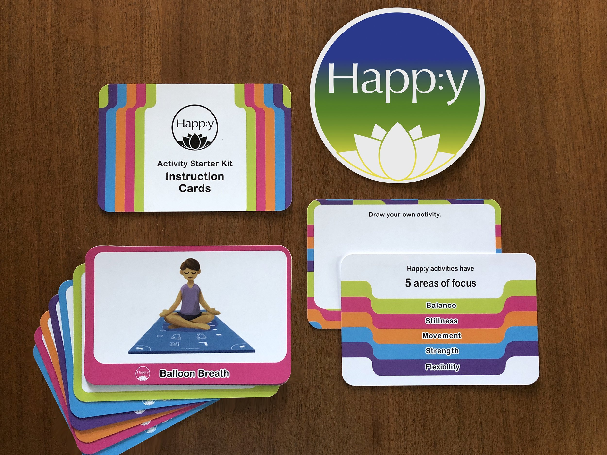
SYSTEM DESIGN / Activity card set developed for parents and home-based learning of yoga.

Mockup for Happy T-shirt design.
Branding, system design, and marketing focused on wellness.
Client Need
A research-based, health business needed a brand to reflect its roots in yoga practice and its focus on accessible tools for movement as a therapy for all individuals and communities. Happ:y Wellness is deeply committed to bringing the health benefits of movement to everyone who needs it with methods to improve balance, strength, and self-confidence.
Core Concept
Healthy, Accessible, Products, and Programs, through Yoga. Happ:y seeks to serve underserved populations and empower individuals facing physical challenges due to aging or different abilities.
Brand Graphic Elements
For the logo, a circle shape was employed to communicate a feeling of friendliness, wholeness, and inclusivity. A stylized lotus flower was designed to make a connection to the yogic traditions the programs are based on.
Typography
The Happ:y wordmark uses Optima, a Humanist sans serif with splayed terminals, chosen to represent strength, balance, and fluidity. Set in upper and lower case the name expresses a core brand ideal using directness and compassion. The unique colon inserted before the ‘y’ forms a joyful emoticon underscoring the positive brand values of Happ:y.
Colors
The primary brand colors, yellow, green, and blue, are bright and positive. This analogous color trio of colors represents a visual connection to the natural world. In the primary logo, they are used in a soft, vertical, linear gradient.
Additional Elements
The founders of Happ:y developed concepts for specialized yoga mats designed for different audiences. The three distinct Happ:y yoga mats evolved from research and beta testing. The Advanced Measurement mat, was specifically designed for clinical assessment uses; the Sun Dial mat features a simplified and accessible design, for use at home by patients in occupational therapy; and the Animals & Shapes mat is perfect for kids and provides therapists with a fun way to connect with their child patients.
In collaboration with the founders, Strong Heart created illustrations, and applied visual hierarchy and principles of unity to refine the marking systems. A secondary color palette was chosen for the mat colors. Sell sheets and retail labels were designed and graphics were made for the website.
Additional marketing materials include a sell sheet, trade show booth banner and table cover design.